The UI
UI is where I know I am weakest. I don’t have the skills or the flair for it, in an ideal world I would have the money to find someone who did and pay them for their skills. So the UI has been through many many iterations already and none of them I am particular happy with. The current front screen
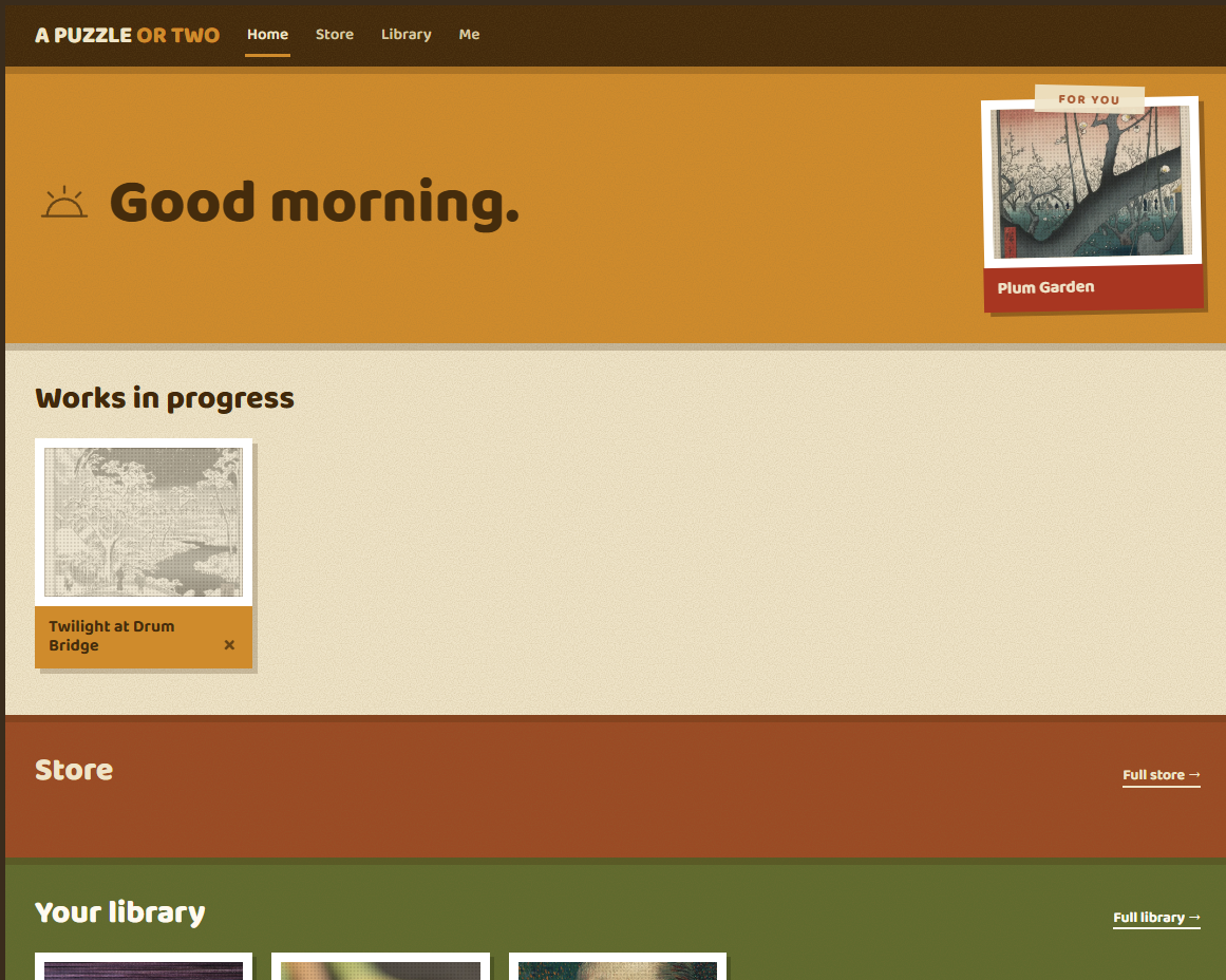
Is the one I’ve settled on for the moment. I like how it’s not like many websites I see now. It’s got colour but doesn’t overwhelm me. Someone did point out the other day that it has 70s vibes, which now I cannot shake out of my head. But it’s not something I look at and go, great, that’s it!
It might go through more iterations but then again, at some point I think, if I actually want to ship the project then it is something I might have to be happy with. Its certainly has elements I like, I like the cards around the images, I like that they are framed. I did go through a stage of trying to show them as puzzle boxes but it just never looked great.
Today is trying to sort out the settings page and the user login, as well as trying to curate more puzzle packs as I am concerned about how the current system will show lots of puzzles. I don’t want to overwhelm the user with selection however so that is something I want to think about, do we have packs in the store on rotation rather than just keep adding packs upon packs upon packs. How do we work in the free puzzles etc.